 乖兔博客
乖兔博客

感谢您的支持,我会继续努力的!

扫码打赏,你说多少就多少


打开支付宝扫一扫,即可进行扫码打赏哦
css3可以通过代码渲染的方式实现网页背景的高斯模糊效果,告别更换背景时候的ps批图。分享三种css3实现网页背景图片高斯模糊效果的方法。
<Style>
html,
body {
width: 100%;
height: 100%;
}
* {
margin: 0;
padding: 0;
}
/*背景模糊*/
.bg {
width: 100%;
height: 100%;
position: relative;
background: url("./bg.jpg") no-repeat fixed;
background-size: cover;
box-sizing: border-box;
filter: blur(2px);
z-index: 1;
}
.content {
position: absolute;
left: 50%;
top: 50%;
transform: translate(-50%, -50%);
width: 200px;
height: 200px;
text-align: center;
z-index: 2;
}
</Style>
</head>
<body>
<div class="bg">
<div class="content">背景模糊</div>
</div>
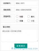
</body>实现效果如图:

<Style>
html,
body {
width: 100%;
height: 100%;
}
* {
margin: 0;
padding: 0;
}
/*背景模糊*/
.bg {
width: 100%;
height: 100%;
position: relative;
background: url("./bg.jpg") no-repeat fixed;
background-size: cover;
box-sizing: border-box;
z-index: 1;
}
.content {
position: absolute;
left: 50%;
top: 50%;
transform: translate(-50%, -50%);
width: 200px;
height: 200px;
background: inherit;
z-index: 2;
}
.content:after {
content: "";
width: 100%;
height: 100%;
position: absolute;
left: 0;
top: 0;
background: inherit;
filter: blur(15px);
/*为了模糊更明显,调高模糊度*/
z-index: 3;
}
.content>div {
width: 100%;
height: 100%;
text-align: center;
line-height: 200px;
position: absolute;
left: 0;
top: 0;
z-index: 4;
}
</Style>
</head>
<body>
<div class="bg">
<div class="content">
<div>背景局部模糊</div>
</div>
</div>
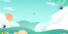
</body>实现效果如下图:

<Style>
        html,
        body {
            width: 100%;
            height: 100%;
        }

        * {
            margin: 0;
            padding: 0;
        }

        /*背景模糊*/
        .bg {
            width: 100%;
            height: 100%;
            position: relative;
            background: url("./bg.jpg") no-repeat fixed;
            background-size: cover;
            box-sizing: border-box;
            z-index: 1;
        }

        .bg:after {
            content: "";
            width: 100%;
            height: 100%;
            position: absolute;
            left: 0;
            top: 0;
            background: inherit;
            filter: blur(5px);
            z-index: 2;
        }

        .content {
            position: absolute;
            left: 50%;
            top: 50%;
            transform: translate(-50%, -50%);
            width: 200px;
            line-height: 200px;
            text-align: center;
            background: inherit;
            z-index: 3;
            box-shadow: 0 0 10px 6px rgba(0, 0, 0, .5);
        }
    </Style>
</head>

<body>
    <div class="bg">
        <div class="content">
            <div>背景局部清晰</div>
        </div>
    </div>
</body>
实现效果如下图: